In the first part of this article, I’ve discussed keyboard accessibility issues which are often found in overlay windows, and which affect both sighted keyboard users and screen reader users. Apart from these issues, dialogs can be tricky to use for screen reader users for few other reasons. Luckily, there are some ARIA roles and attributes which can help to make interacting with overlay windows easier for people using screen readers.
role = “dialog”
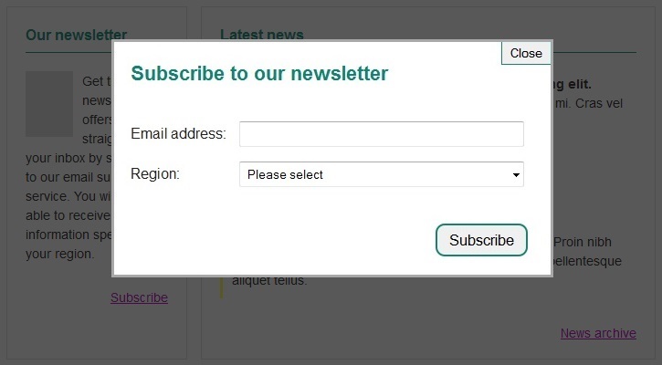
This role was created specifically for modal windows. According to ARIA spec, “a dialog is an application window that is designed to interrupt the current processing of an application in order to prompt the user to enter information or require a response”. Therefore this role is very useful for overlay windows containing forms, such as the “Subscribe to our newsletter” dialog shown in Figure 1.

Applying role=”dialog” on that overlay conveys boundaries of the overlay to screen readers and disables the main page content, identifying the dialog content as being separate from the rest of the page.
There is a catch though – some screen readers will only acknowledge the focusable elements in the overlay with role=”dialog”, ignoring all other content. When the user moves around the overlay using the Tab key, the focus moves from one focusable element to another, link phrases, button texts and form field labels are read out. However, it may not be possible to access any non-interactive elements, as using arrow keys and other shortcut keys controlling the virtual cursor (such as ‘H’ for headings, or ‘T’ for tables) do not necessarily work.
This behaviour is triggered by role=”dialog” causing screen readers to switch from document mode to application mode in which all shortcut keys, which are normally used to control the virtual cursor, are disabled. Since role=”dialog” was created for windows which ‘prompt users to enter information or require a response’ (see ARIA spec above), the document mode in those overlays should be disabled for the users to be able to enter input rather than trigger keyboard shortcuts to move the virtual cursor around the page. This is not a problem if the element with role=”dialog” contains only form fields, labels and buttons. However, this is often not the case; even dialogs with forms usually provide some instruction in plain text (which in application mode will be ignored).
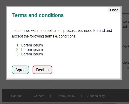
There are two solutions which can be considered to address this issue. The first one is to ensure that screen readers will automatically read out the non-focusable information in a dialog when it opens. For example, let’s have a look at the following dialog content:

Terms and conditions
To continue with the application process you need to read and accept the following terms & conditions:
- Lorem ipsum
- Lorem ipsum
- Lorem ipsum
Some screen reader users will only read out labels of “Close”, “Accept” and “Decline” buttons. But how can the user decide whether to accept or decline the terms & conditions without reading them first? This issue can be fixed by using “aria-labelledby” and “aria-describedby” attributes, as shown below:
Terms and conditions
To continue with the application process you need to read and accept the following terms & conditions:
- Lorem ipsum
- Lorem ipsum
- Lorem ipsum
Now the screen readers will automatically read out the “Terms & Conditions” heading and the contents of element with id=”dialogDescription” when the dialog opens.
This may be a perfectly good solution for lightboxes containing small amounts of text. But what if the overlay window includes a lot of plain text and no form fields or buttons (it’s simply used to display some additional information rather than get user’s response or input)? In that case we shouldn’t really apply role=”dialog” on the lightbox; this scenario doesn’t fit the recommended use of role=”dialog” described in ARIA spec. What if you’re using a plugin which already includes role=”dialog” on the lightbox container by default? In case of jQuery ‘dialog’ component this role can be removed from the overlay window before the plugin is initialised, for example in the following way:
$("#dialog").on("dialogcreate", function (event, ui) {
  $(this.parentNode).attr("role", null)
});

$("#dialog").dialog();
Another option is to put the content-oriented parts of the lightbox within a container which has a role of “document”. This allows the screen reader to read out the content of this container.
Hiding main page content
As we’ve already said, when the dialog is opened the remaining content on the page should be disabled. This is done by keeping the keyboard focus within the dialog and dimming the main page content to bring the visual focus into the overlay window. However, just as it’s important to contain the keyboard focus within the dialog, it’s also important to ensure that screen reader users are not able to move the virtual cursor outside of the overlay window. The virtual cursor is not constrained by tabindex.
For example, when the dialog is open, it shouldn’t be possible to move outside the dialog using arrow keys or shortcut keys such as “H” (which in document mode moves the virtual focus to the next heading on the page). We already know that this is done automatically when role=”dialog” is applied on the overlay window. However, when this role is not used (or on VoiceOver for OSX), the screenreader can still move around the page outside the dialog. To ensure that the main page content is hidden from screen readers when the overlay window is open, ‘aria-hidden=”true”‘ state should be applied on the main page content. When the dialog is closed, this state needs to change to “false”.
JavaScript fallback

Finally, it’s important to remember that all content displayed in dialogs also has to be available to users when JavaScript is disabled. This can be done by displaying that content on a separate page and providing a link to that page instead of the control which triggers the dialog.
Alternatively, if the overlay content is placed in the relevant section rather than at the bottom of the page, the dialog content can be simply shown in that section by default.
Start building accessibility into your projects at the beginning to save time and money, don’t just leave it hanging on the backlog letting it gather up dust. Drill it in.
If you would like Nomensa to help you with your accessibility challenges or to provide you with an accessibility evaluation of your website/mobile app, please don’t hesitate to get in touch.
Take a full look at the digital accessibility services that we offer.
We drive commercial value for our clients by creating experiences that engage and delight the people they touch.
Email us:
hello@nomensa.com
Call us:
+44 (0) 117 929 7333


