There’s a bit of fuss at the moment because an update to the W3C’s accessibility guidelines is coming out soon, almost 10 years after the last update.
I’ll come onto the updates in my next post, but when I talk to regular people (i.e. not accessibility experts) there is some confusion about how to actually use the guidelines.
This post is a quick overview of what they are and the best ways of using them.
To understand that, let’s put the accessibility guidelines in context and look at what the main accessibility testing methods are in general.
Accessibility testing methods
Broadly there are two types of testing:
- Testing with people who have disabilities. Usually in a usability-style setup where the person sits down and tries tasks and you observe what works and what doesn’t
- Testing with rules. You either manually or automatically test an interface against a set of rules
The gold-standard is testing with people and, if you can, I would always include people with disabilities (the end-users) in the process. However, that might not be possible due to cost, stage of development or access to participants.
The rules could take many forms, but the most common is using principles/guidelines/criteria that have been agreed by a recognised group. From here we’ll call them ‘guidelines’ for simplicity.
Guidelines for web accessibility are about the interface – does the interface (e.g. a web page) possess a particular attribute? Once you have a set of true/false statements about interfaces, you can test it with those statements.
For aspects which are technical (e.g. does this image have alt-text?), you can start scripting the tests. That means you can then apply manual scripts (e.g. something in your browser), or a server-based script that automatically runs on many pages or screens.
So in practice the ‘testing with rules’ breaks down to manual, manual with some automation and fully automated testing.
Each testing method has its advantages:
- Testing with end-users is good for prioritisation and education and you can be sure anything you find is a real issue. However, you need to be fairly late in the process and you can’t test that much of a large website.
- Manual testing with accessibility guidelines should find all the agreed accessibility issues and if you choose a good sample of pages you should find most issues.
- Automated testing is great for coverage of a site, but can only find 30-50% of the possible issues. It cannot tell you if a page passes, only if it finds failures.

It is important to realise that manual testing is a sub-set of the issues real people will hit, and automated testing a sub-set of that.
Where the accessibility guidelines come from
The important thing to see is that each of these testing methods actually starts with people:
- Testing with people provides issues
- Guidelines are created to avoid or mitigate those issues
- Some of the guidelines can be tested automatically, to some degree

The further away from the user you get though, the more abstracted the test becomes.
In order to make true/false statements about content that apply to all websites, some good principles have to be dropped. For example, using plain English is of great help to many people, but testing that is incredibly complex. As a guideline that should apply to all web content, using plain english could not be tested reliably, so it could only be included at a lower level of criteria even though it would be beneficial for many people.
Please do bear in mind that usability issues affect everyone, including those without disabilities, and within that are many accessibility issues can’t be found only with guidelines. However, there are known issues that can be found on any website with this set of guidelines, so why wouldn’t you?
The most referenced web accessibility guidelines come from the W3C, which was formed by Tim Berners-Lee, the inventor of the Web who has a ‘benevolent dictator’ status there.
The W3C ‘shepherds’ web standards like HTML & CSS, but also accessibility guidelines because, right from the start, the vision was that ‘this is for everyone’.
The W3C is a membership organisation, with members like Google, Microsoft, Apple, but also specialist organisations like Nomensa. The members work on the standards and the W3C is the host.
Back in the early days of the web, there were no accessibility guidelines. Governments and policy makers wanting some method to assess accessibility were stuck. So rather than come up with multiple national guidelines, the W3C worked on this problem.
What the guidelines apply to
The W3C looked at the whole ecosystem, the end-user has a browser (or other means of accessing a website), the designers/developers create the site and update content via an ‘authoring tool.’
So there are actually three sets of guidelines:
- Web content
- Authoring tools
- User agents
The content guidelines should be used by the millions of people around the world who create or update websites, so they are the most referenced. There are far fewer people creating browsers or authoring tools.
To focus on the Web Content Accessibility Guidelines (WCAG) then, they became even more important because testing with user-agents became so difficult.

We have a plethora of possible user-agents all working in different ways. The image above shows a small selection (14) of some of the most well known assistive technologies.
Many of these also work together, which can make the testing matrix a many-dimensional array that makes browser-testing look like child’s play.
So we need an abstraction layer, a way to ensure the website is doing its bit without spending all the project time on testing.
User requirements vs Content requirements
When starting the process of creating guidelines, there were many sources: Usability testing, surveys, academic research, and experience from accessibility experts.
These requirements usually start off as user requirements, e.g. a user with X disability needs to be able to do Y.
That has to be transformed into a content requirement.
For example, most screen readers allow you to navigate through a page by the headings, you press a keyboard shortcut and it skips to the next one.
So you might create a guideline such as “Users can navigate by headings and lists when appropriate.”
Basing a guideline on the desired behaviour is easier to understand, but it:
- Requires you to know what users and their technology can do
- Is HTML (technology) specific
- Means you have to decide on what is appropriate
In order to avoid those drawbacks, you need to use something like this:
Information, structure, and relationships conveyed through presentation can be programmatically determined or are available in text.
This is something you can determine directly from the content; it is the thing that enables the desired behaviour.
It means: for each thing you display on a page, make sure it is using the appropriate structure. E.g. if something looks and acts like a heading, make sure it uses a heading tag in HTML.
That formulation might not be as easy to understand, but it it a lot easier to test, and it is more stable: if new markup gets added to HTML, you don’t need to update the guideline.
Categories of guideline in WCAG 2.0
To make life a little easier, there are four principles, and within that 12 guidelines which categorise the ‘success criteria’, which are the testable statements.
For example, here is a snippet of a principle, guideline and success criteria:
Principle 3: Understandable – Information and the operation of user interface must be understandable.
Guiideline 3.1 Readable: Make text content readable and understandable.
3.1.1 Language of the page: The default human language of each Web page can be programmatically determined.
When people talk about meeting guidelines, they actually mean the success criteria.
Underneath the criteria are many, many techniques for fulfilling them. You can fulfil it in any way you like, but the techniques provided are a reliable starting point.
A, AA, AAA levels of accessibility standards
You might have heard of the single, double and triple “A” levels.
Level A is essentially the ‘must do’, otherwise there are barriers that are impossible to overcome by some users.
AA represents significant barriers, but there are usually work-arounds.
AAA is useful to many, possibly essential to some, but harder to do.
Most organisations aim for AA, but from our accessibility review work, few actually make single-A until they seriously try to work accessibility into their process.
In general, the larger the barrier for the user, the higher level it is; the harder it is the achieve on a website, the lower it is.
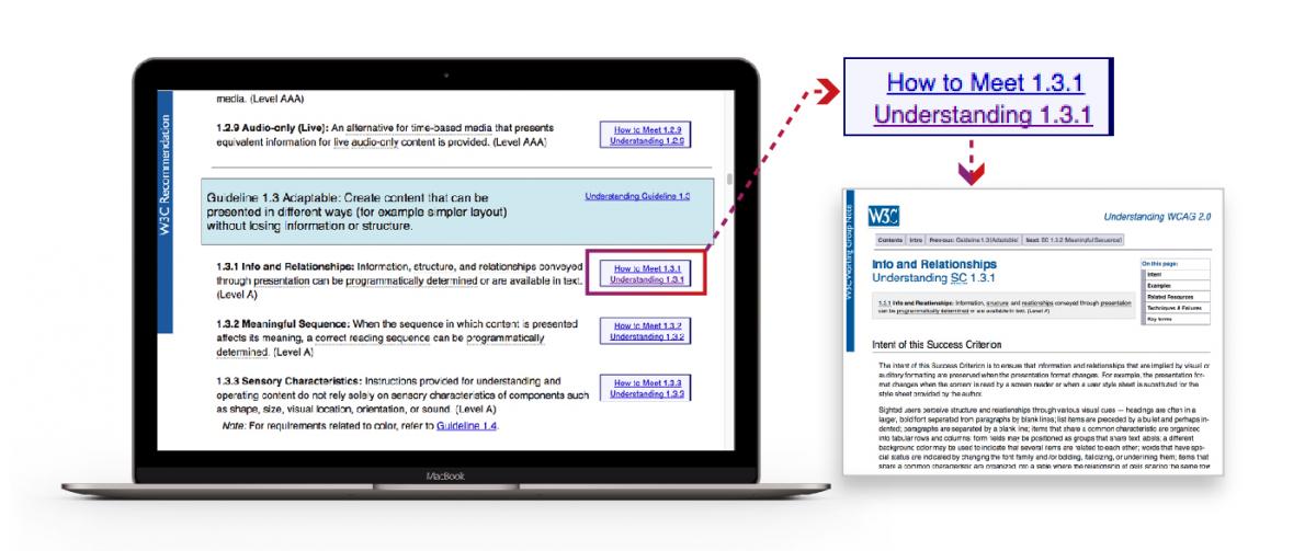
The accessibility guidelines are essentially one document. It does lead through to a lot of explanation, examples and techniques, but I recommend that for any critiera you aren’t sure about, select the ‘understanding’ link for the page of explanation.

Integrating accessibility guidelines into your process
For those fairly new to accessibility, this is how I recommend organisations take on accessibility guidelines.
Understand accessibility in general
Training in accessibility is essential unless people have demonstrated quite a bit of experience in accessibility. There are some fairly persistent myths around accessibility and it saves time to dispel them and put in place a solid framework of understanding for everyone. And I do mean everyone who touches the website (or applications), from the senior stakeholders signing things off, to the content-loader using the CMS in a limited way.
This is not so much training about the accessibility guidelines, but training on how people with disabilities use technology, and therefore what the guidelines mean. If you only consider guidelines, you are getting a very skewed view – you have to consider the UX for people with disabilities.
I rarely start with accessibility guidelines in training because of the results I see later. People tend to leave them too late in the process and you get some very strange results akin to the below.
For example, rather than general heading guidance you can create your own rules about how it should be applied on your website at the template level. In W3C language, that means you specify the techniques to use rather than the general guideline.
I cannot stress how important adapting the guidelines is; research in a medical context has shown that if accessibility guidelines/checklists are imposed on a team without customisation, they have little impact.
If the team understand the intentions behind the guidelines and can customise them to their workflow, they can make a huge difference.
“When it was introduced without any programme or support, it was just impossible for teams to buy into it”
Psychologist & Researcher Stephanie Russ, Quoted from Nature
Accessible by default
Gradually update your core resources such as brand documents, design patterns, and code libraries with accessible-by-default examples and guidance on how to use them. Prune the non-accessible examples.

Test throughout the process, it will take some effort the first time, but it gets easier each time.
Where you run into issues, see whether your process or resources can be updated for next time.
Good uses of accessibility guidelines
To round this up, accessibility guidelines are useful as:
- A reference of accessibility issues and solutions
- A baseline standard for third party providers to meet
- A means of defining accessible solutions when ‘the thing’ is defined, such as a colour pallete
They are not the silver bullet though; you need to use general user-centred design processes to create an effective product for everyone and use the accessibility guidelines to make it a robust interface.
Bad uses of accessibility guidelines
Please do not use the guidelines as:
- A pre-launch checklist
- Any kind of checklist for things you’ve already made
The key is when you use guidelines, so get to know them before your next project.
If you would like to find out more about the web accessibility services Nomensa offers, please get in touch and a member of our team will get back to you.
Explore our case study to witness how we’ve played a pivotal role as Royal Mail’s long-term accessibility partner, driving progress towards WCAG 2.0 Level AA and shaping a robust digital accessibility framework.
We drive commercial value for our clients by creating experiences that engage and delight the people they touch.
Email us:
hello@nomensa.com
Call us:
+44 (0) 117 929 7333


