Fifteen years after the Web Accessibility Initiative was launched(1), which aimed to improve web usability for those with disabilities, online accessibility is still widely ignored. Far too often there is a belief that a compromise must be made between accessibility and an attractive design. As a result, a myriad of misconceptions have emerged, often preventing people from making a determined effort to integrate accessibility into their websites.
Dispelling the myths
Although there are a number of advantages to creating an accessible website, including the potential increase in audience numbers, digital organisations need to demonstrate it is possible to achieve this without impacting on design, and this is often where the problems begin. By failing to ensure sites are functional and accessible without compromising on design, businesses are essentially risking customer experiences (CX) and therefore revenue. A popular myth relating to web accessibility and user experience (UX) is that accessible and attractively designed websites do not ‘go together’. A significant number of advocates of web accessibility tend to have content and/or technology driven websites and do not demonstrate that creativity can also be included as part of an accessible user experience. However, web accessibility need not affect the physical design of the site itself in any way. Instead, all websites should be beautiful and easy-to-use, whilst offering a high level of accessibility which in turn creates an excellent user experience and a positive online journey.
The misconception that websites have to sacrifice design for accessibility comes from the early days of the internet, when technology restricted the developers’ choice in terms of accessibility and design. However, in today’s reality, the web designer has a lot of freedom to design creating and engaging experiences. The Web Content Accessibility Guidelines (WCAG) explain that website designers can use images and videos on their websites as long as they ensure the content is still fully accessible by providing captions for videos or offering alternative text descriptions. Accessible sites do not have to be text-only, with monochrome designs and static content, because after all, accessibility is a key part of UX. There are a number of layout and design options which mostly happen behind the scenes and do not affect the presentation or the accessibility of the website. For example, text size can be big or small, provided it is re-sizeable and you can use as many images as you like, as long as an alternative, detailed description is also offered to the user. Today’s web designers need to think about implementing interactivity features, such as presenting information in a compelling format for modern web browsers, as well as for assistive devices, such as screen readers which will improve the overall web page design, whilst sustaining the website’s accessibility levels.
Designing an accessible future
In today’s digital world it is possible to create a media-rich, interactive, attractive, engaging and accessible site for everyone. Those who claim otherwise often misinterpret the accessibility requirements and perceive them to be more restrictive than they actually are. Web accessibility was once overlooked whereas today it is considered a fundamental objective. It is therefore the responsibility of UX professionals to be accountable for providing a holistic, design-orientated approach, which is usable by everyone, to the greatest extent possible, without the need for any reworking or specialised design. Web accessibility is not only about disabled users being able to access the website; it is about those in charge of user experience who should provide exceptional user experiences to ensure universal access whilst maintaining a high level of creativity, design and functionality.
Case in point:
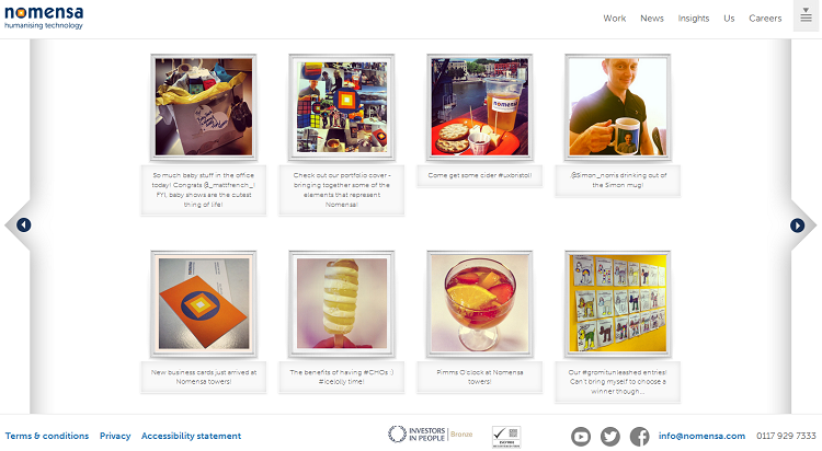
Nomensa recently relaunched its website, Nomensa.com, to demonstrate that attractive design can be accessible.

With an in-house team of web accessibility experts, and designers also trained in accessibility best practice, the website delivers an accessible and fully responsive experience across popular devices. The website takes a content-first approach to the design process which aims to provide an informative and engaging experience. Nomensa.com and the company’s blog are full of rich imagery, highlighting how an accessible website does not have to be void of imagery or creativity, as long as alternative text descriptions are also provided.

The website, which also emphasises how an accessible website does not need to be static, features an Instagram feed on the homepage, which aims to keep the website up-to-date with new content.

World Wide Web Consortium (W3C) Launches International Web Accessibility Initiative
We drive commercial value for our clients by creating experiences that engage and delight the people they touch.
Email us:
hello@nomensa.com
Call us:
+44 (0) 117 929 7333


