As part of a project for NHS UK recently, we helped the team define who was responsible for what aspects of accessibility. After presenting this work at a cross-governmental accessibility event, several people asked for a write-up, so here it is!
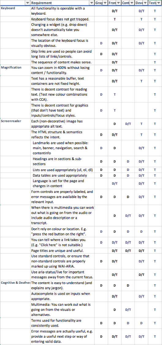
The aspect that triggered the most interest was the table of WCAG 2.1 guidelines mapped to the activities of the NHS UK teams. That table is below, but it is important to understand the process of how that was defined – it is not one-size fits all.
The outcomes
Overall, the outcome will be to bake accessibility in from the start of every new project and improve the experience for people with disabilities using NHS’s online services.
The obvious external outcome is an update to the service manual to including activity-specific advice on making their work accessible. There was a lot of work in making that fit the teams and organisation.
There were also recommendations about how the organisation could bettFer embed accessibility into their culture and process, but that is a topic for another time. This article is focused on defining responsibilities for the design and development process.
The project
The project had three core stages:
- Testing, using automated, manual and usability-testing methods.
- Analysis and training, a process of drafting recommendations and workshopping those with the teams.
- Writing up the recommendations and drafting service manual additions.

Testing
As we were new to the NHS.uk website it was important to assess the landscape. Each type of testing has a place and contributed to the overall view:
- An automated tool was used to scan the site (over 22,000 pages), and found 17 distinct types of issue. More importantly, we could get an overview of which areas of the site were different from an accessibility point of view. That helped us target the manual audit.
- A manual audit was conducted with a sample of 30 pages and found 26 distinct types of issue across those pages. There was some overlap with the automated testing, but the issues found were more significant in most cases.
- Usability testing tended not to find new ‘technical’ issues (e.g. structure, alt text or ARIA attributes), but it did highlight issues with the understandability of search results, and show what navigation strategies were more popular for people with different abilities.
The testing produced spreadsheets galore and a fairly large backlog, as you would expect for a site of this scale that has grown for the last decade.
Side note or relative performance: the site performed relatively well from an accessibility point of view, better than most sites we test. The only site of similar scale that I’d predict would have fewer issues is Gov.uk, but the situations are different. Having an internal accessibility team certainly helps, as does avoiding certain types of content such as video, complex imagery and generated graphs.
Analysis
Working through the issues found, we looked for the key factors that were different between areas of the site. We established that the frequency of accessibility issues aligned with:
- Whether it was produced by the internal NHS UK team, or an external provider.
- How long ago the site technology was created and configured.
- How closely it followed the NHS UK components and style guide.
The core NHS UK site that is created in-house uses the core components and was set up two years ago was excellent. The further away from that setup an area was, the more accessibility issues we found.
So was that it? Just follow the components and all will be well? Not quite.
The service manual (and components) should apply across the digital estate, not just for the internal team. More guidance was needed for everyone creating pages, sections or products for NHS UK.
Refining the responsibilities
Based on the nature of the issues found across the digital estate we started mapping each WCAG 2.1 guideline to the team’s activities.
(For the pedants: A thing that you pass/fail in WCAG 2.1 is called a “success criterion”, but I’ll use the general term “guideline” here, as everyone does and it’s easier to type.)

Figure 1: WCAG 2.1 guidelines mapped to when each would be defined (D) or tested (T).
An image of the table is not very useful, so there is a basic spreadsheet file available for download.
The “t” stands for testing, when something can be tested. The “d” for define means that you would define how something is going to work. For example, someone doing Graphic design should define the heading structure for a new page layout.
Some caveats:
- The language and requirements from the WCAG 2.1 guidelines have been simplified by combining them with “here is how we do things”. For example, if you commit to a responsive design approach and don’t have vertical text, the ‘reflow’ guideline doesn’t need all the ifs-buts-maybes. The effect is to go above and beyond the baseline of the guidelines.
- This was produced for a particular organisation with a particular process and set of roles. Without adapting it for your organisation it may cause unnecessary friction, or you might miss important guidelines that apply in your case. It is a starting point.
- Assigning responsibility to someone without support to understand how to achieve it would be counter-productive. This should be used as part of training, onboarding, or a programme of work that defines how accessibility works within your organisation.
Once we had worked out what accessibility aspect was covered in which activity, we started writing guidance aimed at that activity.
Activity guides
Firstly, there were 14 guidelines that simply did not come up in the testing. Some of these are unlikely to ever come up for NHS UK, such as Orientation (don’t lock the orientation) or Keyboard short-cuts (don’t apply keyboard shortcuts unless the user can turn them off).
The team’s general approach is to use responsive-design and progressive-enhancement, so locking the orientation of the content or applying keyboard short-cuts won’t happen unless there is a radical shift in approach.
We considered these guidelines as ‘met by policy’, and put them to one side.
The next activity we tackled was “Graphic design”, which is the organisational term for visual designers (rather than Content or UI designers). Reviewing the guidelines, which should you consider whilst designing?
Some of the answers are obvious, such as colour contrast, but some aspects were not on (every) designers’ radar, such as focus-styles and skip-links.
The next activity was ‘Front-end code’, which would be relevant UI designers, Front-end developers, and other developers. The start of this activity document said “read the graphic design one” then focuses on keyboard accessibility, zooming, and the HTML semantics aspects.
The ‘Content design’ activity guide was aimed at people adding or updating content in the Content Management System (CMS). It defined how you should approach alt-text, heading structure, link name and more. During one of the workshops we had a particularly vivid discussion on alt-text and captions. When you have content on medical conditions the images are quite graphic!
A key part of content design is writing easy to understand content, for which the team already had good resources so there was no point duplicating that aspect.
The last activity in terms of process was ‘Testing’. This does need to cover all 50 WCAG 2.1 guidelines (at level AA), so it is more extensive. However, the point was very strongly made throughout the process that if testers are finding issues, that is a failure of the process. Everyone needs to do their bit so that QA testers are finding bugs rather than issues. The content overlaps a lot with other activities, but was written from a perspective of testing rather than creating designs or pages.
There were also important activity guides drafted for: User research, video production, procurement, third party contributors, and product & delivery managers. However, these were more general than who is responsible for which guideline.
The draft activity guides were handed over to the NHS UK team, who have since been hard at work integrating and updating the content to fit well in the NHS UK service manual.
Creating a virtuous circle of efficient accessibility
There are many factors that will affect how successful an accessibility programme is. There are obvious aspects such as training and central resources such as design and code libraries.
To highlight the impact, it is easiest to illustrate with extreme examples. (NB: These are not NHS UK examples; I’m creating these from a wide previous experience!)
Worst case scenario
Imagine you start a new project and:
- The whole team is new, e.g. contractors.
- There is no time for training or on-boarding.
- They decide to use a new-fangled framework rather than the organisation’s accessibility-tested component library.
- They use a new CMS.
- Accessibility is seen as something that is tested at the end of the project.
Poor results for accessibility are virtually guaranteed. It doesn’t really matter how good your guidance material is, they won’t read it in time anyway. Even if they do read the material, without the background on the organisation’s general approach they might not understand how to apply it effectively. Learning a new framework and how to make accessible sites at the same time just adds to the difficulty.
Best case scenario:
If you start a new project and:
- The team has at least Fimgone project under their belt with good accessibility results.
- They know the guidance material back to front.
- They use the central component library as a starting point.
- They use the current CMS.
- Accessibility is considered from user-research onwards, with checks performed at every stage.
There might be some ‘bugs’, but the team is likely to complete the project more quickly and with few (or zero) accessibility issues.
If the teams are also contributing back findings from their testing, new components, updates to the service manual, you can create a virtuous cycle where the whole organisation benefits from each team’s progress.
Defining how accessibility should be included in your process is one aspect. If you’d like to discuss an accessibility programme please do get in touch.
We drive commercial value for our clients by creating experiences that engage and delight the people they touch.
Email us:
hello@nomensa.com
Call us:
+44 (0) 117 929 7333


