How do you streamline the onboarding of charity volunteers across over 120 locations and multiple roles? We conducted a discovery for Age UK to find out.
Age UK is the country’s leading charity dedicated to helping everyone make the most of later life. Over-60s are the fastest-growing group in society so Age UK’s services are in more demand than ever. An amazing network of more than 25,000 volunteers is central to this work, performing a variety of roles across 120 locations.
However, consistently onboarding volunteers has been a challenge for the charity. They faced the risk of having many local, bespoke journeys to onboard volunteers which could translate to higher admin costs and inconsistent experiences.
In 2023, they launched a volunteering hub to simplify the application process. Despite a successful launch with internal divisions, to roll out the hub successfully for all potential volunteers, they needed help. With so many different volunteer roles and needs, we identified the need to streamline their journeys and align stakeholders.
Our main aim was to ensure the journey to find and apply for volunteering roles at Age UK is as seamless as possible for our users.
Chloe D’Costa – Digital Product Manager

Age UK commissioned Nomensa to carry out a discovery of the user experience on the volunteering hub with the aim of:
- increasing the rates of volunteer applicants
- increasing conversions of visitors to active volunteers
Understanding the current context
We started with stakeholder interviews, running group sessions with multiple teams.
These interviews helped us to understand the context, priorities and measures of success.
We uncovered objectives including:
- improving the volunteer experience
- creating a single point of entry for volunteering roles
- making the application process competitive
- centralising volunteer data
- improving data use to inform decision-making
- reducing admin time
This insight shaped who we needed to speak to during user testing and helped us capture requirements, constraints and opportunities to improve the service. We found:
- information about volunteers was largely anecdotal
- each division talked about users in different ways
- there was a huge range of volunteer requirements and access needs
Alongside the interviews, our design and UX experts reviewed the hub to assess usability issues and develop hypotheses that informed user research.
Understanding users and their experience
Our understanding of Age UK’s stakeholders and usability issues shaped the approach to user interviews. We tested the usability of the hub and collected insights around motivations and behaviours to feed into a set of proto-personas.
We spoke with a mix of participants who hadn’t volunteered for Age UK before and those who were active Age UK volunteers. This meant we could assess what might influence the conversion of new volunteers and understand what happens after a successful application.
We also tested variations of journeys to assess which sequence of steps was best received by participants. This allowed us to make recommendations on a ‘Lego brick’ approach to journey mapping to support multiple variations in job role application processes.
Considering low digital literacy
When older people are a large part of your audience, digital literacy also becomes a bigger issue. We mapped research participants onto the Government Digital Inclusion Scale based on our observations of their technical knowledge. This prompted a conversation about how to improve the experience of those who are less digitally literate, the benefits of designing an offline equivalent service and how this could increase volunteer numbers.
The importance of having a human link throughout the application journey was a strong theme in the research. Participants felt it could improve the user journey and help people find relevant roles. We identified opportunities for these human touchpoints throughout the journey, highlighting that digital and non-digital channels should both be considered when creating excellent user experiences.
Creating a shared understanding and language around volunteers
We used the insights from our research to inform the creation of a series of outputs. These were shared across the organisation to help Age UK move towards a shared understanding and language. This included a detailed report, an issues log and several interactive, shareable artefacts:
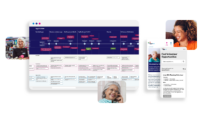
Pen portraits – We created high-level outlines of key user archetypes, showing priorities, behaviours and frustrations. These help the team understand user motivations and how to support different types of users.

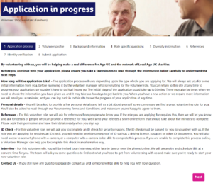
User journey map – We outlined the step-by-step journey users take when making a volunteering application, including successes, frustrations and opportunities. We split this into key stages that could be used as ‘Lego Blocks’ as Age UK starts to define the ideal journeys for each volunteering role type.

Wireframes – We created mid-fidelity wireframes covering key pages such as the landing page, profile section and application steps to help visualise the recommended improvements to the hub.
Defining an improvement roadmap
At the end of the project, we provided advice on how to use these artefacts to support communication, internal alignment and collaboration.
We also created a high-level action plan to feed into the team’s product roadmap so improvements could be made immediately. We mapped our recommendations not only to the original goals but also to address the stakeholder objectives. This helped show their voices had been heard, keeping them engaged in the next iteration and further roll-out of the hub.
Impact
Like many charities, Age UK is on a journey with embedding user-centred design. Our work has enabled them to simplify the overall volunteer journey and created a shared understanding of users.
This will allow Age UK to move towards the hub becoming a single point of entry, reducing admin time and improving the quality of decision-making by ensuring that changes are made with user needs in mind.
Nomensa’s research and expertise has equipped us with the tools and recommendations to inform our development moving forward.
Chloe D’Costa – Digital Product Manager
Thanks to this project, Age UK has successfully continued rolling out the hub and has seen a marked improvement in volunteer applications and conversions. We’re delighted that our work has contributed to an increase in volunteers and we’re excited to see the next stage.
Work with us
Want to improve your member acquisition? Book a 30-minute consultation call with one of our experts to see how we can help.

