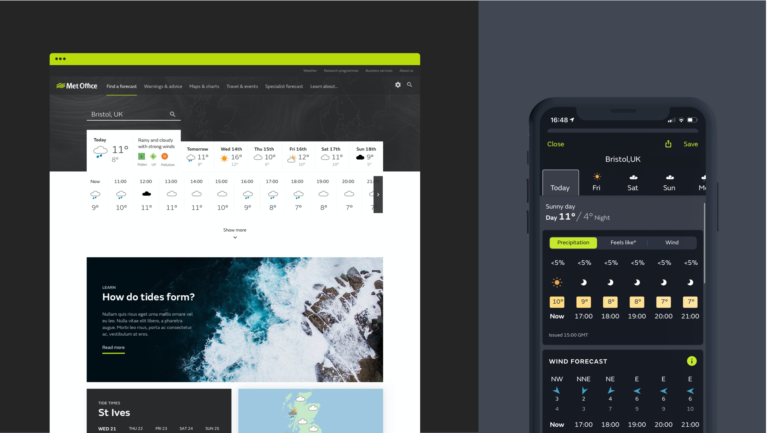
Met Office is one of the UK’s most important national assets. It’s more than a service that tells you whether or not to bring a brolly.
It plays a strategically vital role in the provision of high-quality forecasts and early warnings that enable the Government, industry and the UK public to prepare for and take action to protect assets, services and lives.
The challenge
As well as contending with severe weather, the Met Office also has to compete across a variety of channels with huge media brands and several niche operators. But when armed with a supercomputer, a legion of highly trained meteorologists and a network of observation stations spanning the country, the Met Office is and should be the only place we turn to when we need accurate weather information.
The Met Office entered a collaborative partnership with Nomensa to stay in step with changing customer needs. We provided robust research and insight that could ultimately be translated into a new, responsive website and high-performing app.
Together, we scoped out their sector, conducted exploratory projects for their app presence and led a major website redesign and app evolution; ultimately delivering a digital experience that would engage a broader audience and enable greater reach.
Objectives
There were a number of challenges facing the Met Office’s website. As is often the way with longstanding institutions, the Met Office’s website had grown organically into tens of thousands of pages. Content, while invaluable to its audience, was hidden away from interested eyes. Elsewhere on the Met Office’s horizon, it had identified a chance to strengthen its position in the market by extending its reach and bolstering its reputation.
We began by holding interviews with the organisation’s stakeholders to establish key objectives. These were to:
- Identify and personalise user journeys
- Boost the visibility of the industry-leading content produced by the Met Office
- Increase reach and enhance brand strength
- Push the boundaries of how weather information is communicated
- Capitalise on the Met Office’s bounty of data (of which it used just 1%)
We translated our research into detailed user stories and personas. Rich in meta-data, each identified a channel of choice, fixed criteria, Met Office segments, priorities, pain points, motivations and goals. These user stories were essential as they formed the basis of all the development tickets used to complete the rebuild of the website.

Examining the sector
To carry out quality research based on the objectives, we had to recruit participants based on their location and context of weather forecast requirements. So, knowing weather impacts regions in varying ways, we sent our UX researchers (and now rookie meteorologists) around the UK to get wind of consumer pain points.
Recruits were made up of an array of individuals; ranging from dog owners and ice-cream sellers, to people with health concerns like asthma. Testing revealed a whole roster of behaviours, motivations and lessons that we later used to build our personas.
Cloudy with a chance of content
Next, we set out to restructure the website’s IA (Information Architecture) as it presented a chance to heighten engagement and offer real value to users. Market research bolstered this, finding that surfacing weather-related content was already a strategy for competitors.
We found that educational or interest-driven content appealed to users, but only once they found the forecast information they needed. In the next phase of Alpha, we will devise a taxonomy and tagging system capable of surfacing content based on the weather forecast and related topics. Combined with an improved, user-needs driven IA, this will make it easier to find content and organically explore the website. Looking forward, adding this sort of structure to the content will bring additional value by better supporting voice interfaces and improving the way search engines can preview content in rich snippets.

Humanising the weather
While the validity of the Met Office’s data was never contested – in fact, 29% of users said they went to the Met Office in times of severe weather and for specialist information – testing revealed a lapse between user expectations and understanding. Crucially, this disrupted user behaviour and had a negative effect on brand perception. When users misjudged what a symbol represented, they blamed the data rather than their own judgement.
Elsewhere, we investigated how health conditions influenced the way people interact with weather forecasts. We found that people whose health was affected by the weather – for example, by changes in UV, pollen counts or pollution ratings – were surprisingly passive about checking the weather.
Participants said that this was largely because managing the weather and their health was ‘instinctual’, but it also often led to potential problems, like forgetting their inhaler. Thanks to the diversity of our research, we have a deeper understanding of these users’ needs and are currently devising a persona-specific notification system geared at giving the right people, the right information, at the right time.
Designing for tomorrow
This is just the beginning of our ongoing collaboration with the Met Office. We will continue to evolve and iterate upon not just these stories, but on various other innovative projects, we have in the pipeline. From new features for its app to creating sustainable solutions for its digital estate, it is an exciting time to be working with the Met Office and we look forward to what the future holds – come rain or shine.

Let’s work together
We believe that creating groundbreaking experiences that make measurable differences in the way people live takes a special type of collaboration. Our team designs impactful experiences by leaning on the variety of capabilities and expertise within Nomensa to ensure our solution is bespoke to your needs. We believe collaboration is key, let’s work together.

